I monitor traffic and bandwidth usage in my network with several sensors. In the data tables of these sensors, I can see a volume and a speed value, but in the sensor graphs, PRTG only shows speed values. Why does PRTG not show the volume in data graphs?
1 Reply
Votes:
0
This article applies as of PRTG 22
Graphs without volume lines
Sensor types that can be referred to as delta sensors do not include volume in their data graphs, neither in live graphs nor in historical data graphs. Delta sensors are, for example, sensor types that monitor traffic and bandwidth usage like the SNMP Traffic and SNMP Traffic v2 sensors, the SNMP RMON sensor, or NetFlow sensors. They show the volume value only in data tables, while speed additionally appears in the data graphs.
Volume is the latest retrieved value and speed is the averaged volume during the last scanning interval:
speed = volume / scanning interval in seconds
For example, if the value for volume is 6.000 # (total number of packets) after the last scan, then speed is 100 #/s (packets per second) with a scanning interval of 60 seconds.
Why there is no volume in graphs
In PRTG, the x-axis in graphs indicates the time of the sensor scans. It is the “time line” of the sensor’s data history, so PRTG displays all data in graphs based on linear time. If all sensor measurements would have the same scanning interval (for example, 60 seconds), volume and speed graphs would have a linear conversion and their graph lines would always match each other.
However, sensor scans most likely do not happen so regularly, for example, if you click Scan Now for an extra measurement or if the sensor missed a value because of a timeout. In this case, speed and volume do not convert in a linear way and that causes issues for a time-based graph. For volume display, there are two options:
- If the graph displayed the values as they are, the line for volume would have peaks and valleys. This would visually indicate that there was a change of the volume, although the speed (that is, the averaged volume) stayed the same.
- If we adjusted the volume to the time, the graph points would not match the values in the data table and would be the same as the speed graph but with a different label.
Both ways would cause confusion because someone would always expect that the behavior was different. The only way to correctly display delta sensor graphs both mathematically and visually is to use the speed value.
Example
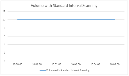
Consider a printer that constantly prints 10 pages per minute. Looking at the volume that is measured in a default scanning interval of 60 seconds, we would get the following values:
| Time | Value (number of pages) |
|---|---|
| 10:00:00 | 10 # |
| 10:01:00 | 10 # |
| 10:02:00 | 10 # |
| 10:03:00 | 10 # |
| 10:04:00 | 10 # |
| 10:05:00 | 10 # |
The resulting graph would show a straight line for the volume:
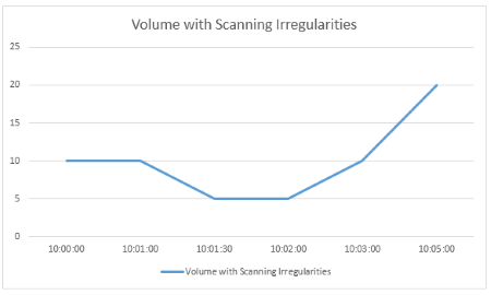
But if there were any irregularities in the scanning interval, for example, because of an extra scan via Scan Now or because of editing device settings, the measured volumes could look like this:
| Time | Value (number of page) |
|---|---|
| 10:00:00 | 10 # |
| 10:01:00 | 10 # |
| 10:01:30 | 5 # |
| 10:02:00 | 5 # |
| 10:03:00 | 10 # |
| 10:05:00 | 20 # |
This results in a volume graph with a curved line that does not let you recognize any peaks:
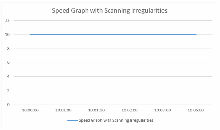
Displaying the measured values as speed averages the volume to time. For the sample volumes from above, this results in the following speed values:
| Time | Value (pages per minute) |
|---|---|
| 10:00:00 | 10/min |
| 10:01:00 | 10/min |
| 10:01:30 | 10/min |
| 10:02:00 | 10/min |
| 10:03:00 | 10/min |
| 10:05:00 | 10/min |
So you get a straight line again in the graph, making it easy to recognize peaks or valleys:
Created on Aug 28, 2014 1:39:13 PM by
Gerald Schoch [Paessler Support]
Last change on Jul 25, 2023 6:53:14 AM by
Jacqueline Conforti [Paessler Support]


Add comment