I want to generate a report of a sensor’s historical data and PRTG asks me if I want to include percentiles. Should I? Are they useful?
1 Reply
Votes:
1
This article applies to PRTG Network Monitor 15 or later
The Value Percentiles Add to PRTG Reports
In addition to averages, PRTG Network Monitor offers percentile calculation in the Report settings. Percentiles are a statistical measure that gives you insight to the distribution of your data, whereas measures like percentages represent the proportion of a certain amount of data.
To illustrate what you can gain from percentiles in PRTG, it is useful to have real monitoring data as an example. The WMI Vital System Data (v2) sensor for example, can monitor an MS TCP Loopback Interface showing how many Bytes are sent per second.
1. Generate a Report Including Percentiles
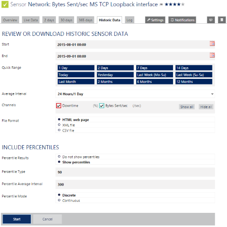
Via the Historic Data tab of a sensor, you can access the report function directly. You have several options how to arrange your report.
- To get last month’s daily Bytes/sec data, choose Last Month in the Quick Range option and 24 Hours/1 Day as the Average Interval.
- Include percentiles by choosing Show percentiles and enter 90 if you want PRTG to calculate the 90th percentile, which means that PRTG will show the value indicating that 90% of the measured data is below it.

Click here to enlarge. - Click Start to generate the report.
2. Interprete Your Report
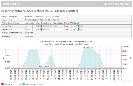
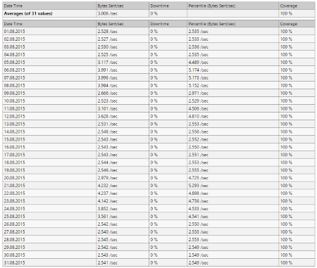
Besides an overview table showing the most important sensor data, a graph illustrating what happened in your sensor channels during the selected period of time, and a sensor status history in table format, PRTG offers a detailed table of the daily sent Bytes/sec during the month you indicated before.


- Have a look at column #2 of the detailed table first. Every row shows you the average channel value per day. For example, on August 1st, the MS Loopback Interface sent 2.528 Bytes/sec and on August 12th, it sent 3.628 Bytes/sec on average.
- Then look at column #4. It shows you the percentile value for the 90th percentile, as indicated before in the report settings. On August 1st, 90% of the time the MS Loopback Interface sent less than 2.535 Bytes/sec, and on August 12th, it sent not more than 4.810 Bytes/sec in 90% of the cases.
- As a third step, compare the average value and the percentile value of August 1st and August 12th. The average of 2.528 Bytes/sec and the 90th percentile of 2.535 Bytes/sec lie quite closely together. On August 12th, however, 90% percent of the measured speed values are less than 4.810 Bytes/sec, while the average speed value of this day is only 3.628 Bytes/sec, which is nearly 30% less than the 90th percentile.
From this observation you can conclude
- that the distribution of the August 12th values is quite heterogeneous, and
- that on August 12th, there must also have been a significant amount of speed values below the average or speed values significantly lower than the average to cause the distance between the 90th percentile value and the average value.
| Compare! | August 1st | August 12th |
|---|---|---|
| Average Bytes/sec | 2.528 | 3.628 |
| 90th Percentile Bytes/sec | 2.535 | 4.810 |
- Note: Please do not conclude that on August 1st, the data traffic speed must have been quite constant. This can be true, but it does not necessarily have to be true, because (potentially very) high peaks have been excluded by the percentile calculation. And this is exactly what the percentile calculation is supposed to do. So if your average value is very close to the percentile value, the 100-x% of unusually high peaks are “hidden” and allow you to offer a fair base for billing. If you need to know more about the distribution of the measured data between the average value and the percentile value, bear in mind that the higher the percentile is (for example, 98th or 99th percentile), the more you will know about the distribution.
After that it is up to you to find the reasons why. Does your network, for example, reflect a weekend vs. workday difference (since August 1st 2015 is a Saturday and August 12th 2015 is a Friday)?
You can also continue your statistics by comparing the lowest and the highest averages and percentiles per period, or by comparing different periods and different devices, and so on.
See also
- For comprehensive PRTG reports including a whole range of sensors, users and user groups, or the system configuration, see the PRTG Manual section on Reports.
Created on Sep 11, 2015 12:51:05 PM by
Martina Wittmann [Paessler Support]
Last change on Sep 23, 2015 8:06:53 AM by
Daniel Zobel [Product Manager]
Add comment