After updating to PRTG version 17.4.35, I need help finding my way around. What are the new features and what other differences are there?
What things have changed in the new interface?
Votes:
0
11 Replies
Votes:
0
This article applies to PRTG Network Monitor 17.4.35 or later
New Look and Feel for the UI and how to Navigate your Way Around
As of version 17.4.35, the PRTG web interface has a new look and feel. This article shows a brief overview of the biggest differences and new features.
Changes to the UI
Aside from changes to the look and feel of the web interface, we have optimized the usability of the menus, made it easier to add objects, and changed the focus to information that is more important for you. This is just to name a few of the changes.
New and Improved Add Buttons in the Device Tree
Add buttons in the device tree have been bundled into one central location. We have also added two new Add Sensor buttons so you can add sensors to your devices much more easily.
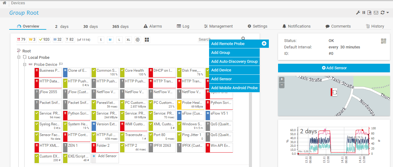
The device tree view icons have also been updated and are now more descriptive.
![]()
New buttons to switch device tree views
Simplified Menu Paths, New Filters, and New Show/Hide Function
You no longer have to navigate through long menu paths to get the information you need. We have simplified the menus and added filters to the respective pages. For example, under Devices | Device List. Click Show Filters to open the filter menu, where you can now search for any related object in your monitoring setup.
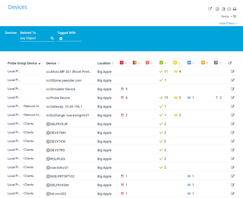
All table lists now have this type of filter and you can hide or show it as you like.
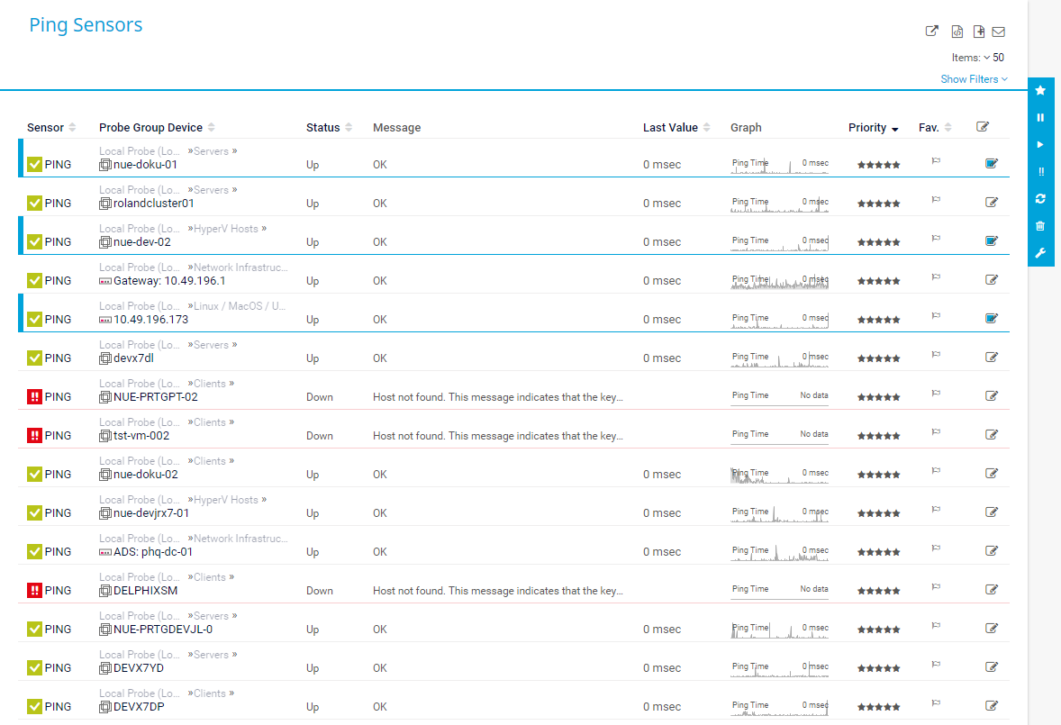
Editing in Table Lists with Multi-Edit
The Edit function in table lists now always works like the former Multi-Edit function. Select the objects you want to edit and the menu appears to the right.
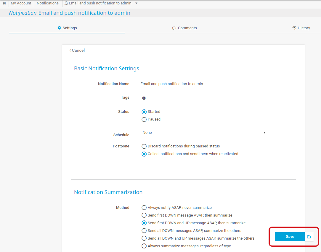
New Floating Save Button in Forms
Forms now have a floating Save button in the bottom right corner. The button turns blue once you have made changes and you can save at any time.
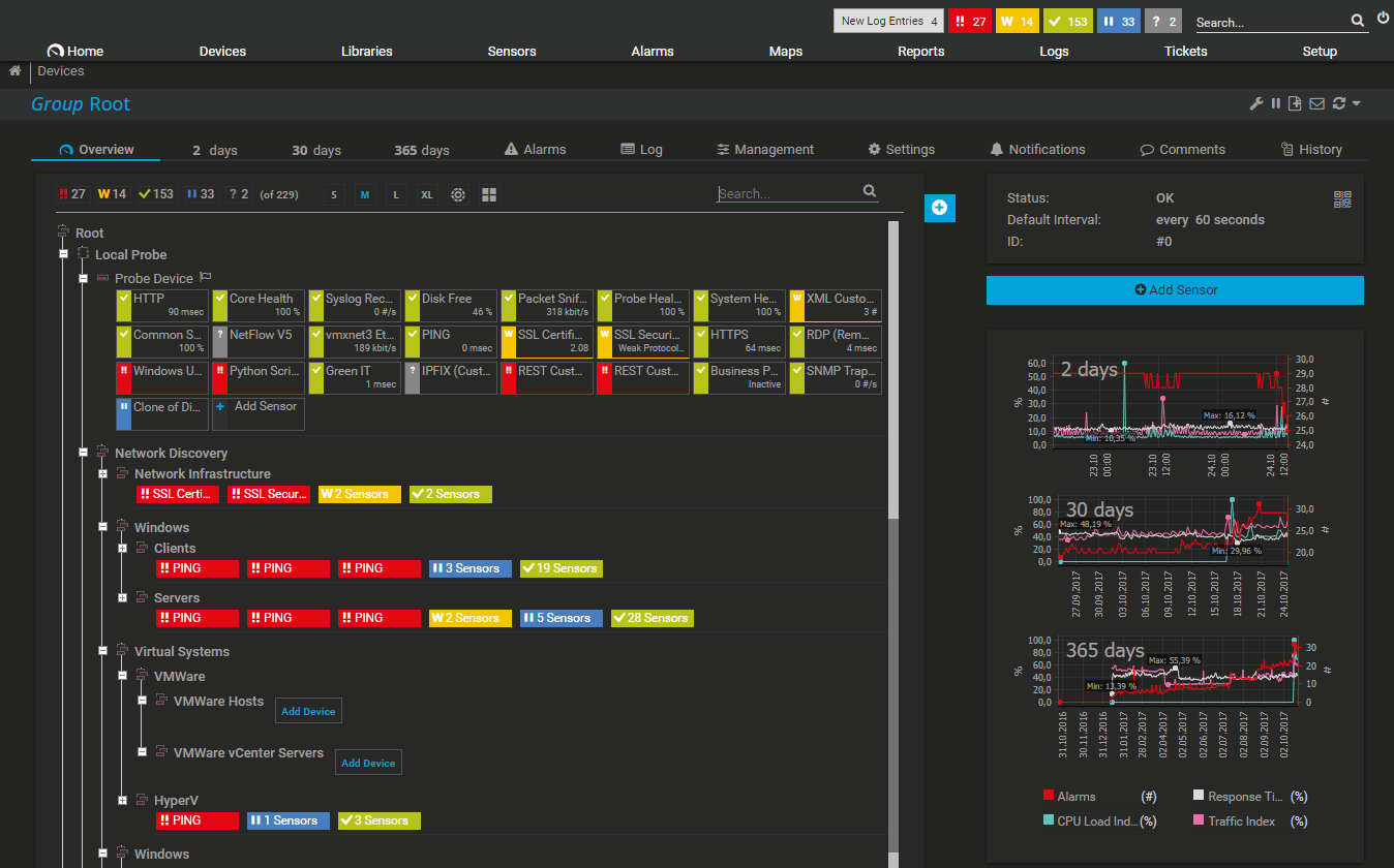
We have also added a new dark theme to the web interface. You can activate it under Setup | Account Settings | My Account, section Web Interface.
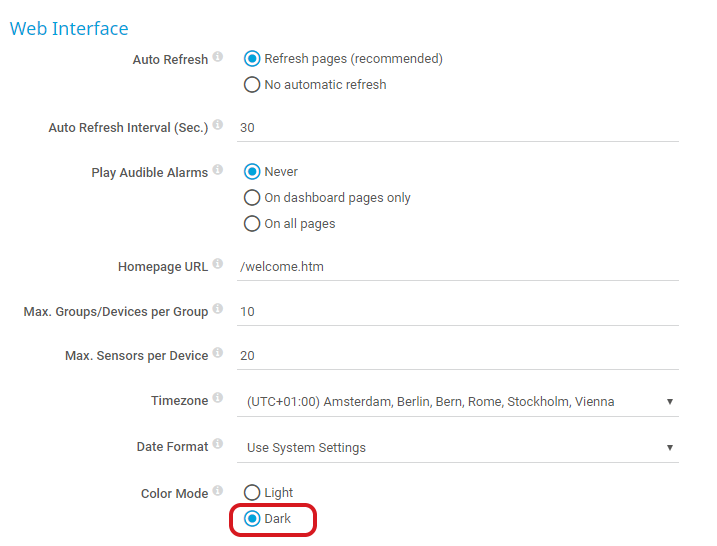
Click Save and the colors in your web interface are automatically inverted.
New Help Icons
Settings have a new help icon for easier access when setting up or editing your monitoring objects. Hover over the icon and the help text appears.
![]()
...and More
This list is not comprehensive, there are many other new things to discover within PRTG.
Note: If you have customized the PRTG web interface using one of the dedicated files, all your modifications will be lost after installing PRTG version 17.3.34/17.4.35. There is still an option to modify the appearance of PRTG, but please note that this is an unsupported and deprecated feature. For details, see this article.
See Also
Created on Nov 14, 2017 3:37:29 PM by
Brandy Greger [Paessler Support]
Last change on Mar 22, 2018 11:16:04 AM by
Brandy Greger [Paessler Support]
Votes:
0
We also moved to the Dark Side :-) It's much better for monitoring. However, were before you could easily see the thresholds set in the graphs as Yellow and Red with a distinct line plotted of the values on top, now, in the Dark Theme, the warning threshold is shown as a very white background in the graph and the plotted line is hardly visible, as it's almost as white as the background.
Also some maps see the black text of graphs disappear in the background, lacking contrast between the two. How can we fix this?
Votes:
0
Hi there,
Good to hear and welcome to the Dark Side. :)
We are aware of this issue, that the graphs are unreadable on Single Channel Sensors with Limits. A quick fix is the following:
- open the "dark.theme" file in a texteditor (C:\Program Files (x86)\PRTG Network Monitor\themes\)
- change line 15 to "#2c6661"
- restart Core Server Service
- profit
Let us know if it works as intended now.
Best regards.
Votes:
0
Thanks, it became a little better, but when the line follows the gridline exactly, it's still not very well readable. It would be better if we could change the background colour for yellow and red as well. Or maybe it's opacity if that was used. Make it a bit more hard yellow and red.
Votes:
0
Hi there,
As described, we will release a fixed version shortly. The above fix is just a workaround and there will be a better, already implemented, solution in the next release.
However you can play around with the "dark.theme" file where you can find the colors for both error and warning areas:
...
      "limityellow":"#e5f7ff",
      "limitred":"#d8e3f9",
...
Just change the HEX-Values to your needs.
Best regards.
Votes:
0
Those colors do not represent yellow and red, but blue-ish and grey-ish. The colors that PRTG uses for threshold area's according to my color picker are for yellow: #FFF7E5 and for red: #F9E3D8 We will wait for the fix :-) Thanks
Votes:
0
Hi there,
You are right, they are not used at the moment as the graphs background with the limits is generated via SVGs. We will fix the transparency and graph background issue in the upcoming versions, unfortunately, there is currently no workaround. :/
Best regards.
Votes:
0
The dark theme is great. There are a few elements that can be hard to read, but overall it's very nice.
Most of my colleagues who use PRTG are not PRTG admins. Some of them would like to use the dark theme.
How do non-admins use the dark theme?
Votes:
0
Hi there,
Every user, no matter if read only or admin, has this Theme option in their account settings under "Setup > Account Settings > My Account".
Best regards.
Votes:
0
The Dark theme is great but does not display dark on public maps. We have displays up around the office and have to log into each as a user for them to display as dark themed.
It would be great if this feature could be added to public maps also.
Regards
Votes:
0
Hello Dan,
Thank you for your message.
You can use the dark theme for public maps as well in PRTG. Therefore, I invite you to check that the user account used as Security context and color mode* (in the maps settings) has the dark theme configured in its settings.
Regards.
Add comment