This article applies as of PRTG 22
Review monitoring data in the PRTG web interface
There are several ways to review your monitoring data in the PRTG web interface:
- In the Overview tab of monitoring objects
- Visual representation of channel values
- Toplists
- In the Live Data tab and x days tabs
- Data for x days tabs for probes, groups, and devices
- Live Data tab and data for x days tabs for sensors
- More options to review monitoring data
Overview tab of monitoring objects
The Overview tab shows an overview of the selected monitoring object and its sensors or channels. The pages share a common structure but some elements differ depending on the object that you select.
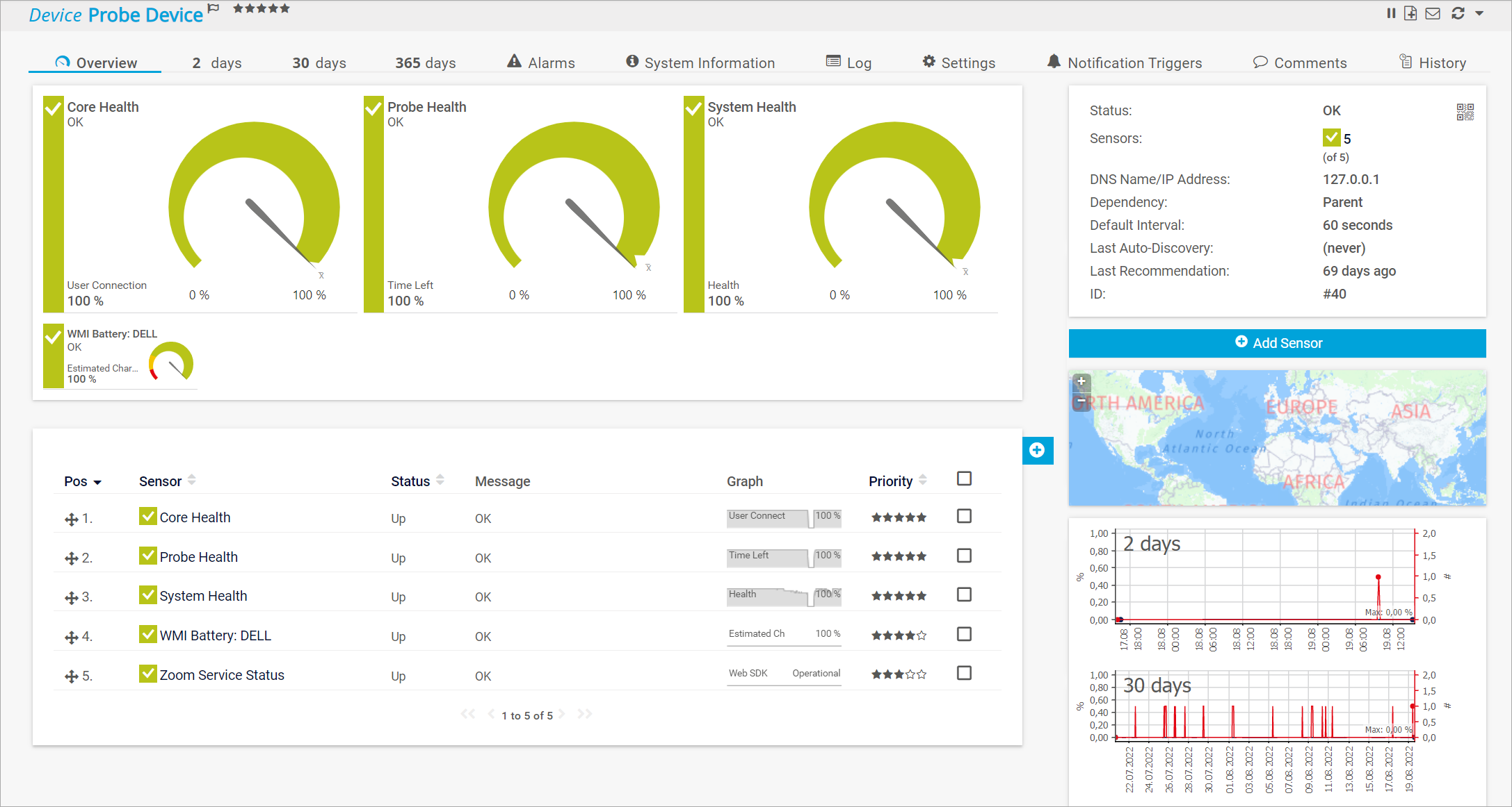
Click to enlarge.
| Objects | Page content |
|---|
| Probes and groups | The tab shows a tree-like view with devices and sensors, a geographical map, as well as graphs that show historic data for different time spans for the probe or group. |
| Devices | The tab shows device details, a geographical map, and graphs that show historic data for different time spans, gauges, as well as table lists of all sensors on the selected device, and a table list with recommended sensors.
You can turn off the recommended sensors detection under Setup | System Administration | Monitoring, section Recommended Sensors Detection.
Assign a 4-star (****) or a 5-star (*****) priority to a sensor to display this sensor on the selected device's Overview tab. PRTG represents sensors with a 5-star priority by larger gauges than sensors with a 4-star priority. |
| Sensors | The tab shows sensor details, the sensor status, gauges, graphs that show historic data for different time spans, a table list with all channels, as well as similar sensors.
You can turn off the similar sensors detection under Setup | System Administration | Monitoring, section Similar Sensors Detection. |
Visual representation of channel values
The main visual representations of channel values are gauges. You can use the gauges as a quick sensor status indicator.
- Overview tabs of devices only show gauges of high-priority sensors with 4 stars (****) or more.
- Overview tabs of sensors show gauges of all channels except the Downtime channel, regardless of their priority. PRTG displays the primary channel with a larger gauge.
- In addition to visualizations as gauges based on sensor limits or gauges based on lookups, there are switches based on lookups for boolean values and bitfields based on lookups.
- The red and yellow sections of gauges correspond to the error and warning limits that you can set in the channel settings, or to the errors and warnings that are predefined in lookup files.
- The x-bar symbol (x̄) in gauges shows the mean of the returned values.
- For gauges based on lookups to remain legible, we recommend that you stay below 120 lookup values for primary channels of sensors with a 5-star priority and below 40 lookup values for all other channels.

Click to enlarge.
Toplists
Toplists are only available for Packet Sniffer and flow (NetFlow, jFlow, sFlow, IPFIX) sensors that break down traffic by IP address, port, protocol, and other parameters.
PRTG can determine the IP address, connection, or protocol that uses the most bandwidth and displays the results in Toplists.
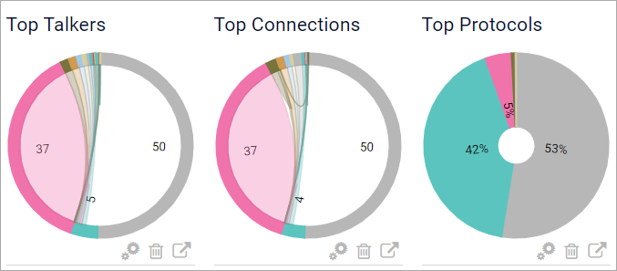
Click to enlarge.
You can find Toplist graphs on the respective sensor's Overview tab.
Toplists are described in more detail in the PRTG Manual: Toplists.
Live Data tab and data for x days tabs
If you select a specific probe, group, device, or sensor, there are several tabs that you can use to review your monitoring data with.
- Select the Live Data tab (this tab is only available for sensors) to display a sensor's live monitoring data.
- Select one of the tabs 2 days, 30 days, or 365 days to display an object's monitoring data for different time spans and in more or less detail.
- The time that graph legends and data tables show depends on the time zone settings of the logged-in user.
- The time spans of 2 days, 30 days, and 365 days are the default settings. You can change the shown days for the different graphs under Setup | System Administration | User Interface, section Graph Settings.
Data for x days tabs for probes, groups, and devices
For probes, groups, and devices, the 2 days, 30 days, and 365 days tabs each show a summary graph for the selected object and time span, mini graphs for all sensors on the object, as well as a data table for the object.
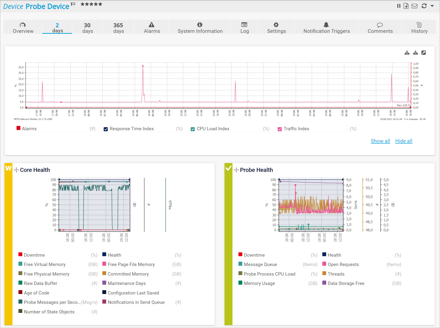
Click to enlarge.
Mini graphs
For performance reasons, PRTG never displays more than 50 mini graphs. You can click a mini graph to navigate to the respective sensor's Overview tab.
Summary graphs
Summary graphs show the number of alarms as well as three indexes:
| Metric | Description |
|---|
| Alarms | Sums up the number of all Down states of sensors on this object during the specified time span. |
| Response Time Index | Indicates the overall request times in your network. |
| CPU Load Index | Indicates the overall CPU load in your network. |
| Traffic Index | Indicates the bandwidth usage in your network. |
The three indexes show trends in your network. The values are based on the readings of all sensors on the selected object. To compute the index values, PRTG uses statistics and compares the values to the highest and lowest readings that have ever been recorded.
For example, a CPU Load Index value of 90% means that the average CPU load for all sensors in your PRTG configuration that measure the CPU load is at 90% of the highest CPU load value that PRTG ever measured.
For more information about indexes, see also How does PRTG compute CPU Index, Traffic Index and Response Time Index?.
You can individually hide single indexes in the summary graph. To do this, disable the check box next to the index name below the graph. The respective line in the graph immediately disappears. You can also click Show all or Hide all to show or hide all indexes. You cannot hide the Alarms metric.
Live Data tab and data for x days tabs for sensors
For sensors, the Live data, 2 days, 30 days, and 365 days tabs each show a graph and data table for the selected sensor.
Note: When you view the monitoring data of a sensor that runs on a cluster probe, you can additionally select if you want to show the data of all cluster nodes, or only of a specific cluster node. To do so, use the Show Data of option above the graph.
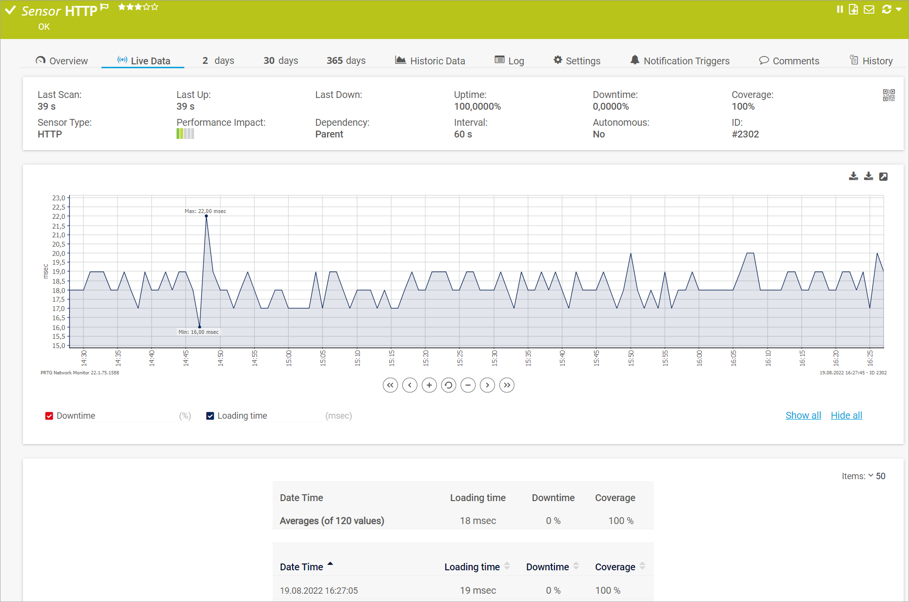
Click to enlarge.
The graph for a sensor shows the values of all channels including the Downtime channel. You can individually hide single channels in the graph. To do this, disable the check box next to the channel name below the graph. The respective line in the graph immediately disappears. You can also click Show all or Hide all to show or hide all channels.
Note: For sensors that have channels with defined warning or error limits, you can also view the respective limits in the sensor's graph. Display only the channel with the defined limits. PRTG highlights warning limits in light yellow and error limits in light red in the background of the graph.
Interactive graphs
The graphs on a sensor's Live data, 2 days, 30 days, or 365 days tabs are all interactive. You can zoom in and scroll along the time axis via the corresponding buttons.

The following actions are available:
 moves the graph one screen to the left and
  moves the graph one screen to the right. The time interval of each screen depends on the selected graph.
 moves the graph to the left and
  moves the graph to the right on the time axis. The time interval on which the graph moves depends on the selected graph.
 zooms in to and
  zooms out of the graph. The displayed time depends on the selected graph. For example, you can zoom in to a 30-day graph so that it shows data for 6 days.
 resets the graph to the default view.
In the upper-right corner of each graph, you can find the following three icons:  .
.
 : Shows a .png or.svg file of the graph in a new browser window. You can then save or copy the file for later use.
 : Opens a larger version of the graph in a new browser window.
More options to review monitoring data
There are more tabs that you can use to review your monitoring data but that will not be described in more detail here:
More
Maike Guba [Paessler Support]
(2,404)
●2
●1
Brandy Greger [Paessler Support]


 moves the graph one screen to the left and
  moves the graph one screen to the right. The time interval of each screen depends on the selected graph.
 moves the graph to the left and
  moves the graph to the right on the time axis. The time interval on which the graph moves depends on the selected graph.
 zooms in to and
  zooms out of the graph. The displayed time depends on the selected graph. For example, you can zoom in to a 30-day graph so that it shows data for 6 days.
 resets the graph to the default view.
 .
. : Shows a .png or.svg file of the graph in a new browser window. You can then save or copy the file for later use.
 : Opens a larger version of the graph in a new browser window.
Add comment